
Modernizing a 100-Year Legacy Brand for the Digital Age
Rebranding and redesigning Tom A. Mason Co.’s identity and website to honor its heritage while preparing the business for the future.


Project Overview
Tom A. Mason Co., a family-owned business founded in 1912, is a long-standing leader in commercial painting, flooring, and surface retexturing. Over the decades, the company grew into a multi-million-dollar operation, completing large-scale projects such as courthouses, stadiums, and commercial facilities across the Midwest.
Despite its success, the company’s brand and website had not kept pace. The logo had not been updated since the 1980s and existed only in low-quality formats with no color palette or supporting system. Their 15-year-old website was unmanaged, slow to load, and provided little detail about services or capabilities. These gaps affected credibility with prospective clients and offered no effective way to attract new employees.
The situation was made more pressing by a leadership transition. The retiring CEO wanted to pass the company to his nephew with not only strong operations, but also a refreshed identity and digital presence that reflected the company’s scale and values.

The Solution
The solution required a phased approach that addressed both identity and digital presence.
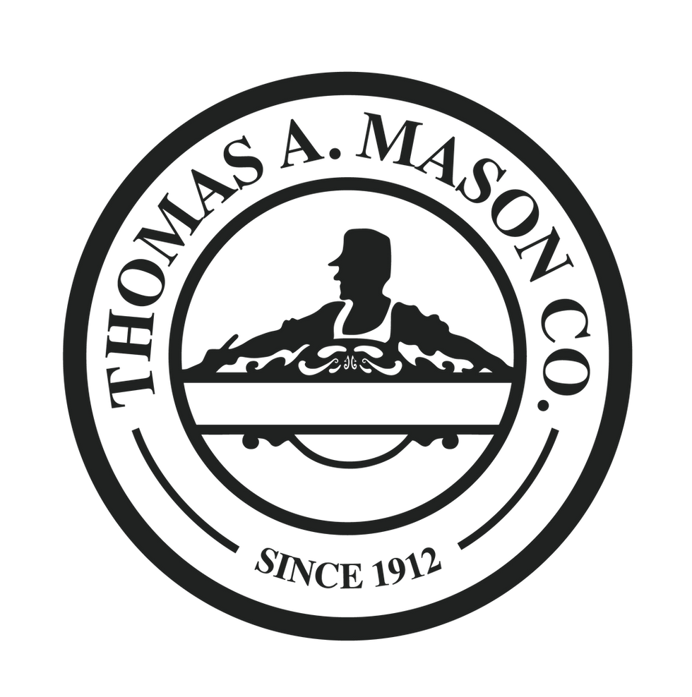
Phase One centered on rebuilding the brand foundation. I redrew the logo in vector format, standardized its lockup with “Flooring & Painting,” and introduced two new variations for more flexible applications. I then created the company’s first brand system, including a modern color palette, typography hierarchy, and supporting graphic elements inspired by painting and flooring textures.
Phase Two focused on redesigning the website. Beginning with sketches and wireframes, I structured the homepage as a narrative journey — starting with a bold hero video and headline, then moving through company history, project highlights, service overviews, client logos, and a section dedicated to safety and union workforce values. The site was built in Wix Studio, with responsive breakpoints for desktop, tablet, and mobile, as well as micro-interactions to elevate usability.
This phased approach ensured the website was not simply a design refresh, but a storytelling tool supported by a strong and consistent brand identity.


The Process
The solution was a phased approach that addressed both identity and digital presence. Phase one focused on rebuilding the brand foundation by redrawing the logo into scalable formats, creating new variations, and developing a modern color palette and type system that established consistency for the first time in the company’s history. Phase two centered on redesigning the website into a clean, narrative-driven platform that highlighted the company’s 100-year legacy, showcased major projects, and communicated values like safety and professionalism. Together, these updates created a cohesive system that honored tradition while positioning Tom A. Mason Co. as a modern leader in their industry.

DISCOVERY: Partnered with the client to define project goals and identify gaps in brand assets. Asked targeted questions about company history, services, and messaging to ensure design and content would align from the start.

RESEARCH: Rebuilt the legacy logo in vector format and developed a color palette and typography system. Conducted a competitive audit and explored cross-industry examples to guide positioning and usability.

CONCEPTS: Sketched homepage layouts to map flow, then translated them into wireframes in Figma. Integrated curated imagery, textures, and brand elements to create a modern yet approachable design system.

REVIEW: Built the site in Wix Studio, set brand colors and fonts into the platform’s style guide, and added custom micro-interactions. Reviewed the site with both client and peer designers through two full rounds of feedback before final approval.

Deliverables: Packaged the complete brand system and launched a responsive, user-friendly website that immediately improved visibility and credibility for the company.

Key Takeaways
Heritage Brand Modernization
Modernized a 100+ year-old family business by balancing its long-standing legacy with a refreshed identity system and digital presence that speaks to future growth.
Expanded Brand Foundation
Rebuilt the logo in scalable formats, created new variations, and introduced a flexible color palette and typography hierarchy — the company’s first true brand standards.
Narrative-Driven Website
Designed and launched a website structured as a storytelling journey, featuring history, major projects, core services, client logos, and a section dedicated to safety and union values.
Client-Centered Collaboration
Worked closely with leadership to refine copy, select authentic imagery, and ensure the design reflected real services, materials, and workforce diversity.
Technical Execution
Developed the site in Wix Studio with responsive breakpoints, integrated brand colors and typefaces into the digital guide, and added custom micro-interactions for polish and usability.
Measurable Impact
Website traffic increased 400% in the first quarter after launch, while new leads grew through the client inquiry form and recruitment improved with a dedicated careers portal.


BEFORE

AFTER
